Official Edgar Rice Burroughs Tribute and Weekly Webzine Site
Since 1996 ~ Over 15,000 Web Pages in Archive
Presents
Volume 1972
Presents
 |
An interview with Richard Hescox Conducted by Phillip R. Burger Visit the Richard Hescox Trading Card Gallery 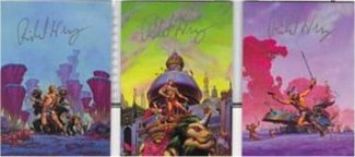 |
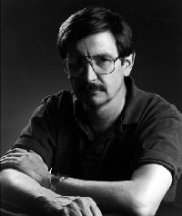 |
As an Edgar Rice Burroughs aficionado it may be biased of me to say that Richard Hescox achieved his greatest success in the science fiction art world when he painted the covers for the 1992 reissue of Burroughs Venus books. Even so, it was not long after this that Mr. Hescox left the book cover art field for the more lucrative field of computer games. I was going to keep it up [doing these covers] in my spare time and try to do a few each year but the gaming industry turned out to take too much of my time. Still, over one hundred and thirty-five book covers is an impressive body of work.Richard Hescox graduated from the Art Center College of Design in Los Angeles in 1972. While struggling to make a go of it in the book business he has worked as a motion picture production illustrator, advertising artist and storyboard artist; he was also an exhibit designer for the Los Angeles County Museum of Natural History. He currently works for various game companies on a freelance basis from his home in Reno, while also painting his "Fine Art" fantasy paintings.
Being in the same neck of the woods (Seattle) when this interview was originally done, I was able to speak with Mr. Hescox, and we talked at length about his early years in the science fiction publishing world and what it was like to cut ones teeth on the Burroughs-style romances still in vogue at the time. (This interview was conducted on February 10, 1999.)
Ace Reprint (art by Roy Krenkel)
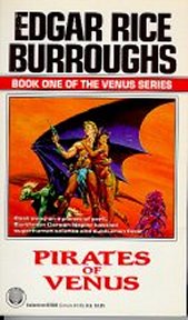
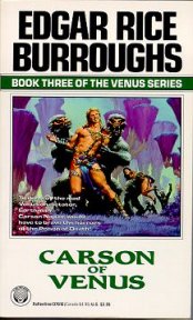
"As a kid I read various science fiction books until I discovered the Ace reprints of Edgar Rice Burroughs. I voraciously read those until I ran out of them, basically. Then I went on to read more science fiction and fantasy. So I had an interest in that general subject matter and Edgar Rice Burroughs specifically. I was on a separate track going to be an artist, and after graduating from art school and looking around for work and doing other things I finally got a chance to do strictly paperback covers, and slowly over the years built it up so that it was a full-time job. But the entire time my pet desire was someday to do Burroughs illustrations. Years before I had done sketches for some possible paintings, long before I ever was given an opportunity to illustrate [Burroughs]. In fact, the ones I got furthest with were for the Venus series, and so it was really fortuitous that they [Del Rey Books] gave me the Venus books because that was probably my favorite series and certainly the most interesting one to illustrate.
My first published work after I got out of art school was for Marvel Comics for some of their black-and-white magazine comics -- Monsters Unleashed, Vampire Tales. Then pretty soon after that I approached Don Wollheim at DAW Books and got into paperbacks. That was pretty much the majority of my illustrating jobs over the years except for a period in the mid 80s [when] I was supplementing that with movie work, motion picture advertising, production art, and just any illustrating job I could pick up. After a number of years of that I finally got into a position with the paperbacks where they were giving me enough work so that I didnt have to take any of the "film" jobs. I kept that up until I got out of paperbacks and into computer games.
The school I went to was one of the best art schools in the country but was very definitely an illustration school, not a fine arts school, which actually I think was better because they taught you the nuts and bolts, whereas a fine arts school would have taught you to 'do your own thing', which you can do at home without paying a tuition. I went to the Art Center, which is where Michael Whelan, Jim Gurney, Dave Mattingly and Paul Chadwick went.
Having gotten out of art school the thing to do was to create the best paintings you could for your portfolio. I had always been interested in book cover illustration, and I think I initially came out of art school thinking, Well, thats not really a likely field to work in and Ive got to do other illustration work to make a living. Then Rick Hoppe, who also came from Art Center and is now an animator at Disney, said, Well, why dont you do paperbacks? So I started making sample paintings along those lines, just things that could be book covers, trying to emulate the work of Frazetta, Krenkel, and Robert Abbett. Doing an imitation of another artist is never going to be great, because its somebody elses technique, but it was a learning process. Actually, it wasnt until halfway through my paperback career [that] I really found my own style.
I was showing some of these sample paintings that Id been doing at the San Diego Comic Con art show and Neal Adams, who liked to help promote young artists, let it be known that he was going to have a private talk with the artists in the art show room after it had closed for the day. We (the artists) all met him there. We discussed various peoples works and he picked out a few of us whom he wanted to get samples from, so he could try to get us some work in New York. I sent [Neal Adams] samples and he showed my work to Marvel, and thats where I got my first professional work.
Generally I didnt care for Marvel's art directorial procedure or style. They would heavily retouch [my work] themselves. Once I painted a cover and sent it to them, they retouched it and retouched it and retouched it, and finally they retouched it so far that they called me and said, It doesnt look like your work anymore, were sending it back for you to redo the changes we made but do it in your style. They [had] done so much that I just decided to paint the whole painting fresh again. So I painted it again from scratch, and sent it off to them and they retouched it again before publishing it. Some art directors you find are like this; they dont feel theyre justified in their job unless they can change your work to prove that they know what theyre doing, even if they dont. There are some good art directors, and some bad. The best ones were illustrators first before becoming art directors and understand the process better.
I was working at the Museum of Natural History doing exhibit design, and every once in a while Id do a cover for Marvel. I kept doing more samples, too, and finally when I thought I had enough good ones I submitted them to DAW Books actually I submitted to several places, and DAW Books was the only one that really responded. Don Wollheim had a reputation back then of giving young people just starting out a break. Probably about 75, 76. So I submitted samples to him, sent slides, and he wrote back and said, Yeah, we want to give you some work, dont have anything right now but Ill be in touch with you when I do, and a couple months later he sent me an assignment.
The assignment came as a manuscript of the book, and he said, Read this, do up three or four sketches and send them to us. So thats exactly what I did. Then he would pick the one he wanted and send it back for me to paint. Usually he would just send it back approved, [but] occasionally hed send it back and say Well, lets change this little thing here, and Id fix it and send it off again, and thats how it worked.
Title Page Sketch
Walkers on the Sky (1976) was my first book cover for him. I am embarrassed to even think of that cover now, but at the time I painted it I thought it was pretty good considering my lack of experience. Since Id been doing sample work up until then it was the first book cover painting that I had to do to please someone else. There were more restrictions on it than when I was doing my own samples, so it wasn't exactly how I would have wanted to do it. Technically it was naive. It was okay for someone just starting out, it wasnt completely without talent, but certainly I was without training or experience.
I learned a lot [in art school], but in terms of how to really illustrate, I learned far more after I got out, basically by doing it; you try it and you do it wrong and you find out the right way and slowly improve. Theres an old expression about when you learn to draw, its mileage with your pencil, and after youve drawn seventy miles with a pencil, then you can draw well. Until youve drawn seventy miles worth of lines then you cant draw well. It's just practice. So when I got out of art school and I had learned a lot of theoretical and technical things, but I didnt know how to illustrate until Id actually done a lot of illustrations.
Since [Wollheim] was giving me, a young illustrator, a break and since he was paying me very little, he was easy to please and happy with what I was doing. With an occasional suggestion he'd let me art direct the pieces myself. In that regard I think he trusted the artists, if he saw real talent there, to know better what they could do and to push themselves to do their best work.
For the first couple of years Id worked for him, I had never met the man. Wed spoken on the phone and dealt through the mail. I was living in Pasadena, California at that time. I didnt get too many jobs from him, one or two a year here and there. But looking back on it, I wasnt that good yet. He was giving me a break and he was letting me learn my skills over a number of years by doing it. Then somewhere in the late 70s he was coming out to California for a convention and he called and said that he was going to be out here, so why dont we meet? By this time my work had gotten much better. So, he came over to my house, and we met and during the visit he offered me a series of three Michael Moorcock books. He gave me the books that were published as: City of the Beast, Masters of the Pit and Lord of the Spiders (all 1979).
City of the Beast is very much a cover Im unhappy with, for the same reasons Ive already mentioned. Lord of the Spiders I liked a lot more; the technique wasnt much better but just the concept, the image and the composition, graphically I thought was really good. And Masters of the Pit was technically the best of the three. I was learning as I went along. If Im not mistaken I think that was the first cover that I actually used some acrylic paint on. I think the background clouds were done in acrylic and the figures were then painted in oils. Im not sure chronologically how much longer it was before I switched to acrylic. A couple of years yet.
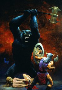
Early on I was [given scientific romance covers], firstly because there was a lot of that stuff being published, and secondly because the other kind of books were given to the more established artists that he was using. I also think that the stuff I had already done for him led him to think, Well, he does that kind of stuff well, so let's keep going. We (other artist and I) used to call this stuff guy/girl/goon covers, as they would invariably have one hero, one maiden in danger, and a monster. Actually, a lot of my old Marvel monster stuff was guy/girl/goon as well. You do have to make a distinction because the Burroughs books, and the better Burroughs clones, go well beyond just that formula. The Burroughs stories are very romantic tales, very colorful, and endangering a woman with a monster is not the main purpose of the book. But similar covers wind up on some of those stories anyway.
Id had an interest in that type of story because of Burroughs. I loved the Burroughs stories, thats why I always wanted to illustrate them; when I got Burroughs clones I always had high hopes for them but none of them ever seemed to come up to the quality of Burroughs. Otis Adelbert Kline and some of those early ones were close but they just didnt quite have the style that he had. I think the Kioga books, of all the non-Burroughs romances, came closest to being as well written as his. I liked [William] Chesters writing, more than any of the other Burroughs pretenders. When I would read a Burroughs book I really came away believing in the world hed created and the depth of it and how well thought out it was and [how] it all held together. In the other books it always seemed like the author would make up a bizarre civilization, but they didnt make it a really three-dimensional culture, and they'd just stage their adventures in front of this odd architecture with strange creatures running around and that was about it. Every time I got one of these Id have great hopes because Id run out of Burroughs books to read. I had hopes of finding an author that would thrill me the way Burroughs could, but none of them ever really did.
When I did the Burroughs books I went back and read them and I just noted down EVERY tiny detail. I knew his worlds were so well thought out that some detail mentioned in one chapter would relate to what something in another chapter should look like, and so I had to have all the details so I could do it correctly and not have all the Burroughs fans jump on me. In the books by the Burroughs clones, there wasnt that much wealth of detail and I didnt feel like Id really come to know the world by the time Id read the book. So I would just go through and try to find enough detail in the writing to flesh it out into a painting. On the one hand, if they dont tell you what something looks like, it gives you the freedom to make it look like anything you want, but I find that too much freedom is stifling and that I like to have enough detail to get my ideas flowing. Burroughs gave me lots of detail but there was still enough running room to put in my own style on top of the accurate details. In those other books, even though there was an adventure story going on and there were weird creatures in them, some were a pain to try to illustrate. It was hard to find any scenes that sounded to me like theyd make a good cover. Id have to do at least three for every book, and sometimes it was just like pulling teeth to get three different ideas from one book. Sometimes Id even wind up doing three different versions of the one scene because it was the only thing that happened in the book that was any good.
Shais Destiny (1985) was one of the first covers I did for DAW that I really felt I was getting a handle on my technique, and it resulted from a couple of things. Just one or two covers before that I had switched from oil to acrylic. The other thing that happened was that I went to the 1984 Worldcon in Los Angeles. I met Whelan there, and I saw how [he] was handling acrylic, and Mattingly's work was also in acrylic, and it gave me ideas and I started applying them with my next cover, which was Shais Destiny. Not the best cover Id ever done but it was a step forward, I really felt like I was making progress on it, and pretty quickly after that the progress just escalated. Before, every book cover had been a painful struggle all the way through. [Now] it turned into a situation where I know how to do this.
Then it came down to: read the book, find a good scene, apply my newly refined techniques and skills, and it all just kind of came together in my covers. At that point there was a kind of jump in quality and I became, at least in my own eyes, much more of a professional and my work became more successful as an illustration.
It wasnt until, around 1985 [that] I made a trip back to New York. I set up appointments with everybody ahead of time, I [brought] better quality samples with me, and out of that trip I immediately got work from Ace; I also started getting work from Avon and Questar. I had picked up several clients which, with the DAW assignments, started feeding me enough work so that I didnt have to take the advertising work anymore. I [could] just do paperbacks full time.
And doing that freed up a lot of my thinking processes. I didnt have to worry about this other type of artwork anymore; I could hone in all of my equipment and my studio setup and my procedures to just do paperback covers. This really helped the efficiency too, so for a number of years after that I did nothing but paperback covers.
I can look at [my covers now] and I see some that I just think are failures as paintings. Pirate of Worlds End (1978) I wasnt too happy about. My early paintings were often 24" x 36". I was working in oil at the time, so I needed a big surface because I couldnt get really detailed in oils back then, and I was struggling with my technique, so it was hard for me to do what I wanted to do in a painting. If I had done a good sketch and I got an effect that I wanted to recreate, reproducing that effect in a big painting didnt always work because I just didnt have command of the medium. Later on when I switched to acrylic and gained more experience, an effect would occur and Id say to myself, I know how to do that. Id figure out this real quick and loose technique. Then Id could get on with the rest of the painting.
[The interior illustrations for the DAW books] were very interesting to me in that a lot of my friends were comic book artists who were good at pen-and-ink drawing, and I never was that good at it. I never had developed the skills for drawing in ink, and suddenly I had to! I found it a very interesting exercise. I really got a good deal of joy out of trying to make them well designed little spot illustrations. Some were better than others. I was a big fan of Alex Toth, the comic book artist, who is a master of simple black-and-white compositions that convey a great deal of information. Milton Caniffs Steve Canyon drawings were also like that. I never tried to draw in their styles. I couldn't. But I always admired [the] simplicity of a really good composition in simple black and white that just told a whole story, so I tried to do that in my drawings.
I was hardly paid anything for the interiors; I only did them because Wollheim really liked having them in his books. So I didnt really worry too much about them as illustration. I thought, fine, Im just trying to do something interesting with them. A couple of them were really nice drawings, a lot of them were just okay. Even though the black and white drawings were financially a waste of time I was sort of sad when DAW stopped using them because I really missed them after that.
There were certain [paintings] that [flowed easily right from the start]. Manhounds of Antares (1981) was an early one that went really well. I do a loose lay-in when Im starting a painting and just knock in a bunch of the colors to get everything there, and I let the paint do accidental things because I just have to get it on the board. Sometimes the accidents work really well and I go, Oh, I dont have to change anything, or only tweak it a little and its done. Other times you do a lay-in and youve got to go back and repaint everything in laborious detail. I think a lot of stuff in the lay-in worked well on Manhounds, and therefore it was just a process of finishing up the main figures and it went quicker than usually.
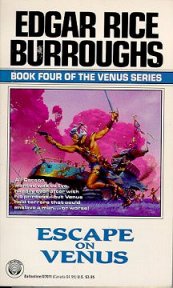
I remember that the Burroughs covers went well also. I was so in love with the project that I was enthusiastic and hyped for it and I just enjoyed working on it. I dont think I had any real problems with any of the paintings, except that I really wanted to do my best work, so I put a lot of extra labor into it. Obviously I went back and reread them with an eye towards illustrating them this time, but the one cover idea that came out completely unchanged from the very first time I had read the book as a teenager was the land battleship scene for Escape on Venus.
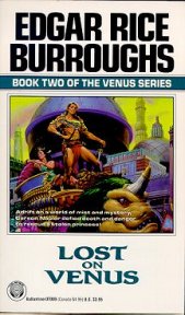
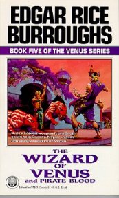
[Del Rey was] in the process of bringing out all the Burroughs books again, and they were doing it series by series. Each series was going to have a 'look', but every single series is going to have a completely different look and a completely different artist. Part of the job, when I was first doing sketches, was to help to decide what was going to be 'The Look' of this series. Based on my sketches they decided it was going to be a full-bleed cover with this little key line around the main area of the illustration. Instead, after I painted them for that treatment, they wound up cropping the images down to the key line and blotting out everything outside of it. So, since the paintings were done to the original design they got badly mauled in the publishing. I was happy when they told me I was going to get full bleed, but on the other hand, when they changed it without any notice, that just messed everything up.
Additionally they published two of my covers on the wrong books, so the one that should have been on Carson of Venus was on Lost on Venus, and because of the new cropping you have all the main figures there, but the crowd of some two hundred people I painted at the bottom was completely lost. The only place you get to see how they really look is in the trading card set where they were reprinted. The point of that illustration was that they were in a big parade of a festival in one of the Venusian cities, but all you can tell now is that there are two people sitting on top of this beast and thats it. Sometimes art directors the bad art directors say, We want the main characters big, big, BIG, so they will crop in, and sometimes theyll crop out an absolutely necessary story element. Without that detail the cover doesn't tell the story. They don't realize that, they just dont know visually how an image works. Some of them dont have any visual interpretive ability, and yet they are art directors.
I willingly made the change to the computer industry because I was kind of tired of the whole freelance world. It was still going along okay, but it was getting a little wearing, not knowing when the next book was coming in. They usually came in regularly, but once the job was finished, if you didnt have one logged ahead, you dont know if another one is coming in and it wears on your nerves a bit. And of course I had to pay for my own insurance and my own social security, which is twice as much as youd have to pay if you work for somebody. There were a number of reasons that I thought it would be nice to be an employee again, and at just the right moment a friend of mine, who was an art director at a computer game company, called me and said, Do you want a job? and so I decided to take it. Ive been in the industry every since, what is it, three different companies now.
[Science fiction is] not as appealing to illustrate [any more] possibly because of the books that are being published now. Im finding fewer and fewer science fiction books that just grab my attention and make me want to read them, therefore if I was in the business of illustrating them it would be less interesting projects. Artistically the business has changed too. In the early days of paperbacks there were some good illustrators around and also a few great illustrators, Krenkel and Frazetta, but there were also a number of hacks in the business, and the quality of the covers periodically went through doldrums. Around the time I got in there was what I would term as a sort of renaissance, with people like Whelan and me. Tom Kidd, Mattingly and a bunch of others were getting in the business that I think loved the genre and had the technical skills and training and were starting to paint terrific illustrations.
Science fiction has never been considered a high-end part of the paperback business; it was thought of as more for arrested adolescents to read, which is not actually the case, but thats how it was viewed by the industry in general. And because of that we had a lot of freedom to do really different cover images. I always nostalgically look back on the days of the pulps as being this golden age when, if you were an illustrator, you had all these companies you could go to, you could paint a pirate one week and a cowboy the next week and science fiction, and just keep busy doing these really interesting pictures. I realize they didnt pay very much, it was the Depression, but it seemed like this wonderful heyday. I probably have an overly romantic idea of what that era was like. Maybe if I was around then and found myself painting hundreds of pictures and still starving I wouldnt think it was so great, but it seems like it was a romantic time.
Kioga of the Unknown Land was great because it had a lost land and there were mammoths alive in it. So I did a lot of mammoth sketches. For Kioga of the Wilderness, it was a little more problematic. There werent any monsters or creatures.
They were running around in the Arctic and there was a polar bear scene, so I was able to use that. Now, for the first one I did, One Against the Wilderness, I really had to cheat on that one! It was a nice adventure of people in the wilderness with Indians, but there wasnt anything to make a real science fiction cover out of.
So I found the one scene that I could possibly make something out of. That was [where] Kioga is rowing this younger Indian boy to a village, but Kioga has put on a disguise of a river monster.
So thats what I did as the cover. Kioga really only put some leaves in his hair and slapped some green paint on his face. I cheated and made the monster in the canoe look much more like a real alien paddling with an Indian in front.
It looked like a much more interesting science fiction image. So if people bought that book expecting something else, then blame me.
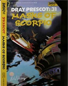
Of the Prescot [illustrations] one of my favorites was Masks of Scorpio. I would always try to work the title into the painting. If it was Werewolves of Kregen I wanted to show a werewolf, and if it was Fliers of Antares I wanted to show the fliers, and if it was Fires of Scorpio I wanted to show something to do with fires, (although that was a real hard one to find a good fire image). Omens of Kregen -- you couldnt do anything about omens. But Masks of Scorpio ... I just couldnt find a mask anywhere in the story.
So I just threw it all away and I thought, I always loved those Barsoomian fliers of Edgar Rice Burroughs, and they have the same kind of thing on Kregen. There was a scene where [Prescot] leapt from one craft to another, so I was just going to go all out and do my version of Warship fliers for that one. I kind of liked it for that reason.
When I did my first Gor book (actually, I did a reprint of one, Marauders of Gor) - I just read the published book and created a new cover for it. Then they assigned me the new Gor book coming out, and they said, The book isn't written yet, so were going to have the author write you and tell you what the story is about so you can figure out how to do the cover. I got this four-page letter from John Norman.
The first paragraph on the first page told me the story very briefly. Then the next paragraph, which contained the longest unbroken sentence I had ever seen written -- it must have been several hundred words long -- basically laying out his philosophy of the position of men and women in relationship to each other, the absolute antithesis of womens liberation. That was followed by three and a half pages of cover suggestions. Such ideas as: Girl-bound-at-post; Girl-submits-to-warrior; Girl-about-to-be-hurled-to-the-furs; and just on and on, everything about degradation and subjugation of women, idea after idea after idea like that. So that was the help I got from the author.
Copyright 2007: Phillip Burger
 |
Amazon
Synopsis
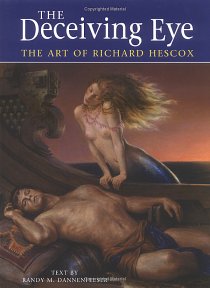
Richard Hescox has been using our deceiving eye for over thirty years to take us to worlds of fantasy. His vividly realistic images, created with gifted draughtsmanship and augmented by his brilliant use of colour and composition have made him one of the most widely sought-after illustrators in the fantasy and science-fiction field. Now, for the first time his illustrations are available in book form - featuring more than 100 of his favourite pieces. Hescox has opened the gates to his formidable imagination and invited us to spend time within the worlds he has brought to life, among characters he's visualized from the words of noted authors as well as those entirely of his own creation. Despite being best known for having illustrated over 130 paperback book covers, encompassing a wide range of science fiction and fantasy authors, including Edgar Rice Burroughs, Marion Zimmer Bradley and Roger Zelazny, Hescox has also done extensive work for the motion-picture industry as well as computer-game artwork. He is one of the industry's most versatile artists, and one of its most respected. |
Visit
the Richard Hescox
Trading
Card Gallery
![]()
ERBzine 1972a

The Art of Richard Hescox
The Richard Hescox
Biography
Fantasy Fine Art Gallery:
Richard Hescox
ERB Artist Encyclopedia
ERB C.H.A.S.E.R. Pirates
of Venus
ERB C.H.A.S.E.R. Lost
On Venus
ERB C.H.A.S.E.R. Carson
of Venus
ERB C.H.A.S.E.R. The
Wizard of Venus
Back to the 
Contents Page


WEBJED:
BILL HILLMAN
BILL
AND SUE-ON HILLMAN ECLECTIC STUDIO
All
ERB Images© and Tarzan® are Copyright ERB, Inc.- All Rights Reserved.
All
Original Work ©1996-2007/2017 by Bill Hillman and/or Contributing
Authors/Owners
No
part of this web site may be reproduced without permission from the respective
owners.